
UI Design & Design Systems Built for Scalable Digital Products
Create consistent, intuitive, and scalable interfaces across websites, applications, dashboards, and digital products. Klyssel Labs combines interface design, reusable components, responsive layouts, design systems, accessibility principles, and developer-ready specifications to create digital experiences that are both visually clear and technically practical.
Eliminating Interface Inconsistency with Scalable Design Foundations
Why ad-hoc UI patterns create technical debt and slow engineering releases, and how our systematic design tokens and component libraries create visual harmony at scale.
The Growth of Interface Fragmentation
Different teams may create components independently, spacing and typography may vary between screens, interaction patterns can become difficult to maintain, and developers may spend unnecessary time interpreting design decisions.
Without a structured design system, adding new features can gradually increase design and development complexity.
Tokenized Design Systems & Production-Ready Handoff
We begin by understanding the product, users, business objectives, technology environment, and existing interface. We then establish visual foundations, interaction patterns, reusable components, and design rules appropriate to the product.
The result is a UI system that helps teams create consistent experiences while making future design and development work easier to maintain and scale.
Core Capabilities & Deliverables
End-to-end interface design covering Figma design systems, responsive component libraries, WCAG accessibility, and engineering-ready specifications.
Interface Design
Design clear, modern interfaces for web applications, mobile applications, SaaS platforms, dashboards, websites, and other digital products.
Design Systems
Create structured systems covering colors, typography, spacing, grids, components, states, interaction patterns, and usage guidelines.
Reusable UI Components
Design reusable components such as buttons, forms, navigation, tables, cards, modals, filters, tabs, notifications, and other product-specific interface elements.
Responsive Design
Develop layouts and component behavior that adapt across desktop, tablet, and mobile screen sizes.
Accessibility-Focused UI
Apply accessibility considerations to typography, contrast, interaction states, navigation, forms, component behavior, and other relevant interface elements.
Developer-Ready Design Handoff
Provide structured design specifications, component states, measurements, assets, interaction details, and documentation to support efficient implementation.
Scalable Component Architecture & Design Tokens
A look into Klyssel's modular interface systems: standardized color tokens, typography scales, and atomic glassmorphic UI components engineered for zero-ambiguity developer handoff.
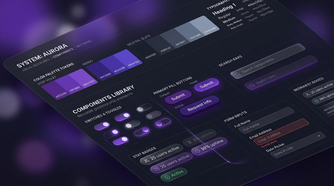
Measurable Operational Outcomes
UI design outcomes depend on the product, audience, existing interface, implementation quality, and business objectives. Klyssel Labs focuses on creating measurable improvements where appropriate:
Greater Interface Consistency
Establish reusable patterns, unified tokens, and cohesive components across digital product experiences.
Faster Product Evolution
Reduce design duplication by creating reusable foundations for new features and screens.
Seamless Developer Handoff
Give designers and developers a shared system of tokens, rules, and documented interaction patterns.
Intuitive User Workflows
Create predictable interfaces that help users navigate, complete forms, and adopt new features effortlessly.
Design system velocity gains and product adoption metrics depend on codebase maturity, engineering adoption, team workflows, and ongoing component governance.
Architecture & Technology Stack
Klyssel Labs selects design and development tools according to the project's requirements and existing product environment.
Design & Tokens
- Figma component libraries & auto-layout
- Design tokens (JSON / Style Dictionary)
- Atomic design component hierarchy
- Interactive clickable prototypes
- Dark & light mode theme variables
UI Foundations & Layouts
- Typography scales & optical hierarchies
- Accessible WCAG AAA contrast palettes
- 8pt grid & fluid spacing systems
- Elevation, blur & glassmorphic tokens
- Custom iconography & SVG asset systems
Components & States
- Buttons, pill badges & action triggers
- Complex data tables & sorting filters
- Modal dialogs, drawers & popovers
- Multi-step form inputs & validation states
- SaaS analytics & data viz widgets
Development Alignment
- Tailwind CSS & Tailwind UI mapping
- React & Next.js component blueprints
- Vue, Nuxt & Flutter component parity
- Storybook documentation & live states
- Git-friendly token handoff workflows
Klyssel Labs selects design and development tools according to the project's requirements and existing product environment.
Implementation Lifecycle
A disciplined engineering flightpath designed to validate business value before production scale.
Product & Interface Discovery
We understand the product, users, business objectives, existing interface, technical environment, content structure, current components, and design challenges.
Visual Foundation & System Architecture
We establish the core design foundations including typography, color, spacing, grids, visual hierarchy, component principles, and design tokens where appropriate.
Component & Interface Design
Reusable components and product interfaces are designed with different states, responsive behavior, interaction patterns, and real-world content in mind.
Documentation & Developer Handoff
The design system and interfaces are documented and prepared for implementation. Developers receive relevant specifications, component states, assets, and interaction details to reduce ambiguity during development.
Frequently Asked Questions
Key answers to common questions about architecture, system integration, security, and project delivery.
Build Interfaces That Scale With Your Product
A strong interface should look consistent, feel intuitive, and remain maintainable as the product grows. Klyssel Labs combines UI design, design systems, reusable components, responsive experiences, accessibility considerations, and developer-ready documentation to create interfaces built for real-world products.
Tell us what you're building, what your current interface looks like, and where your team is experiencing design or product challenges. We'll help define the right UI and design-system approach.
